Discover
To understand current user frustrations and identify market standards for order navigation.
- User Research (Customer reviews)
- Competitive Analysis
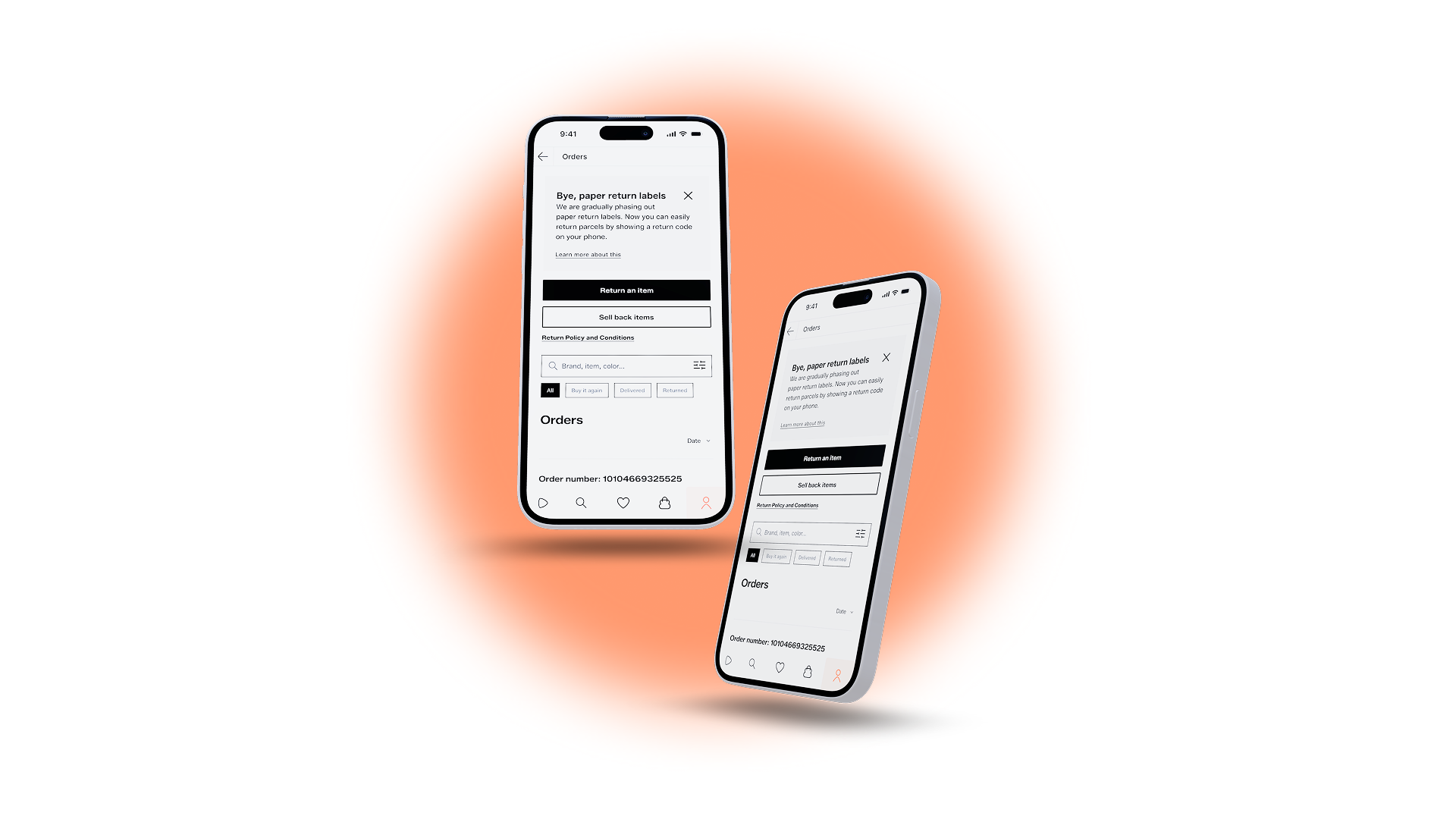
A research-driven feature addition to Zalando's order history experience.
View Prototype
Summary
This is a course project focused on Zalando's order history experience. Instead of a full redesign, the goal was research-driven: understand where real users struggle, then propose features that slot into the existing product.
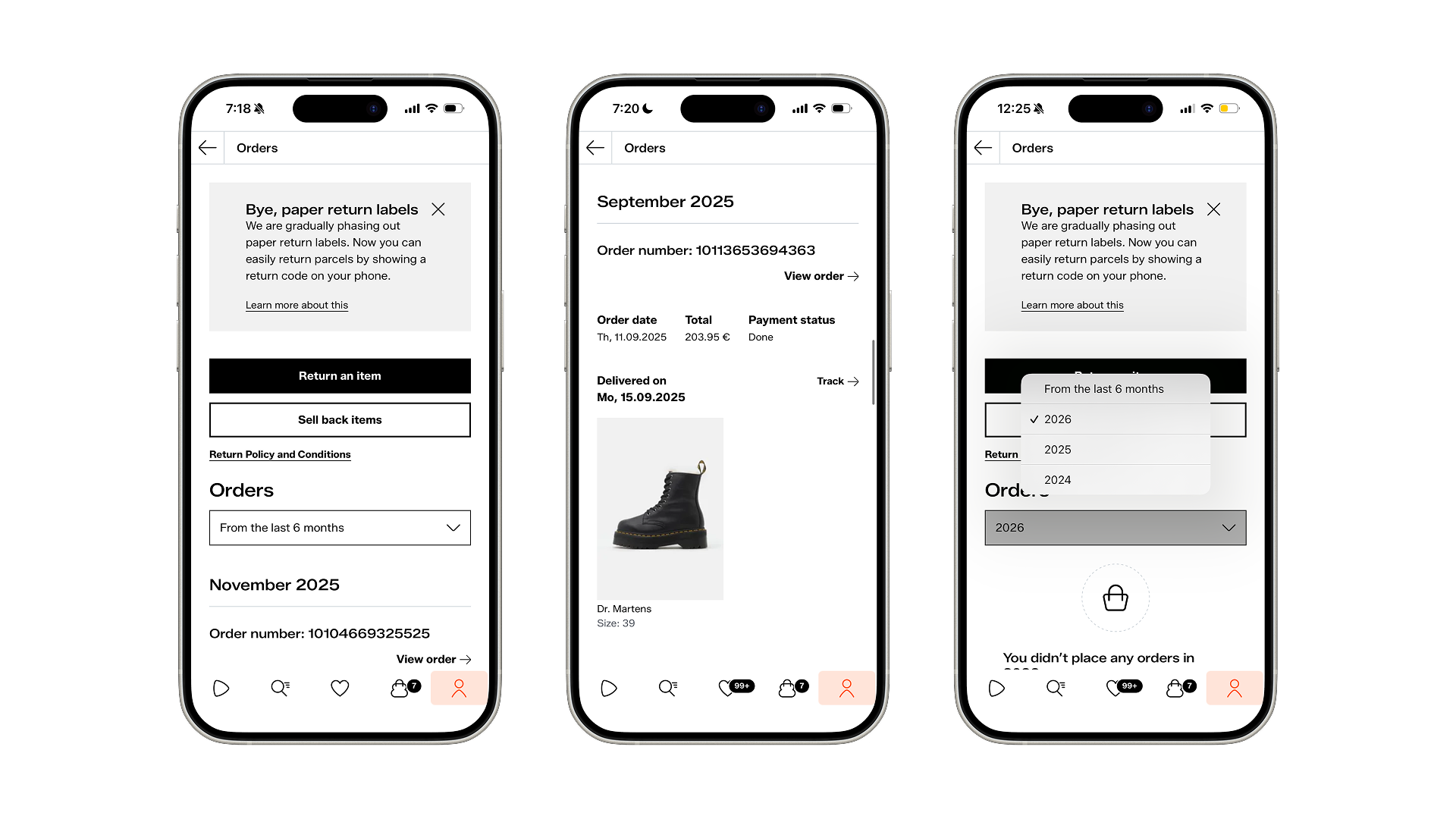
Through user research and a Double Diamond Lite process, one friction point stood out clearly that managing past orders is harder than it should be. No keyword search, a single date filter, and a long undifferentiated list. For someone tracking a return or trying to reorder something, that's a frustrating dead end.
The outcome was three targeted feature additions: keyword search within order history, multi-parameter filtering by status, category, and date, and clearer order status visibility. Small additions, but aimed at a high-intent moment in the user journey where trust and loyalty are on the line.
Role : UX Researcher, Designer
Scope : Order history page
Tools: Figma, Claude, Maze
AI-assisted: Claude for analysis, ChatGpt for content
Duration: 4 Weeks
Course Project
double diamond lite
To understand current user frustrations and identify market standards for order navigation.
To narrow the scope and define a clear goal: Reducing the "Time-to-Item" for past purchases.
To evaluate solutions for the best balance between user needs and business/tech constraints.
Refining the design based on test results.
Discover phase
I researched customer reviews on Trustpilot, App store and Google Play
“Checking old orders on my phone is a nightmare. The page takes forever to load as you scroll. A search box would let me jump straight to the item name.”
”I have hundreds of orders. I only want to see my shoe purchases, but I have to scan through the entire list. We need category-based filtering.”
”I only want to see my purchases from last month, but the system shows me everything back to 2022. Quick date-selection chips are a must.”
”I wanted to check the size of a coat I bought 3 years ago, but I had to scroll forever. I wish there was a search bar at the top so I could just type the brand and find it instantly.”
“Checking old orders on my phone is a nightmare. The page takes forever to load as you scroll. A search box would let me jump straight to the item name.”
”Sometimes I forget the exact product name and just want to search for 'jeans'. Searching within orders is a basic feature; why is it missing?”
”I have way too many orders. I wish I could just tap a 'Shoes' or 'Last 6 Months' button to filter the list instantly. Scrolling through everything is such a waste of time.”
”I constantly buy from the same brands. Not being able to search or filter by brand within my own order history is a huge miss.”
Discover phase
Feature
Amazon
ABOUT YOU
ASOS
Mytheresa
Zalando
Current
Keyword Search
Yes (Full)
No
No
No
No
Status Filter
Detailed
Basic
Return focus
Minimalist
No
Date Range
Multi-year
Past 6 months
Past 6 months
Full History
Limited
Visual Style
List-heavy
Personalised
High Fashion
High Fashion
Product-first
Buy It Again
Dedicated
Shortcut
Integrated
No
Available but not directly

Discover phase
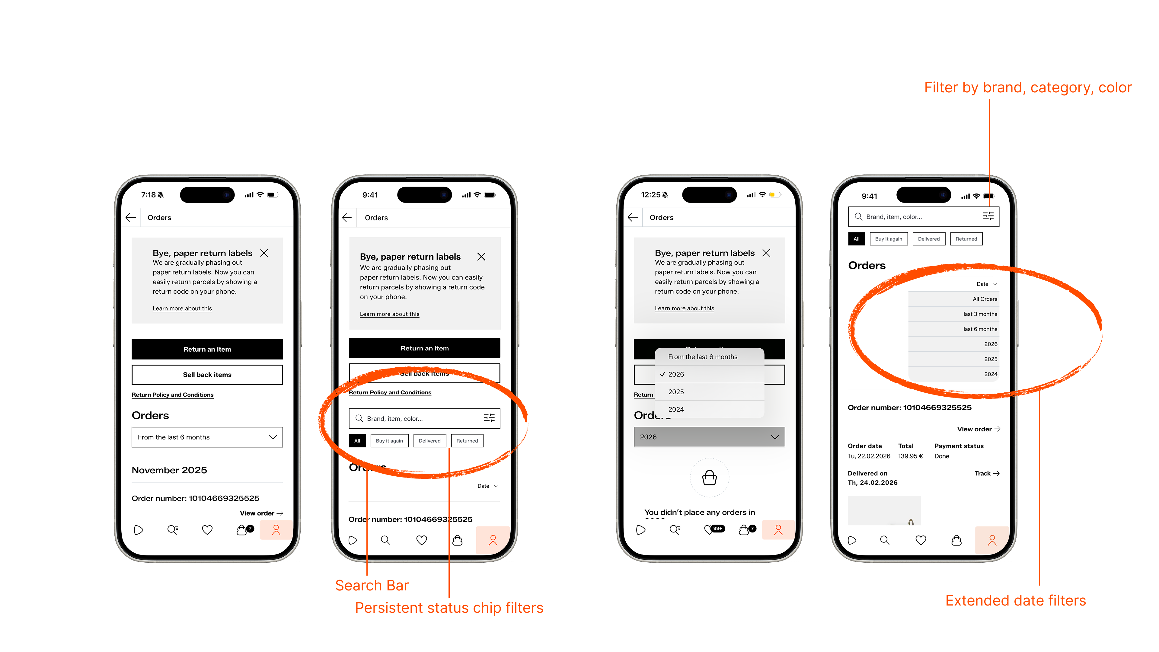
Persistent Search Bar
Keyword search with inline chips: status, category, brand, date
Status Filter
Clear visual separation of all, delivered, returned orders
Date range quick-select presets
"Last 30 days", "Last 6 months", "This year" options reduces infinite scroll fatigue
Brand / category filtering for repeat buyers
Supports loyalty behaviour as "show me all my Nike orders"
Product visual + direct "Buy Again" shortcut
Supports faster re-ordering, reduces search clicks
Define phase

The Goal: Find specific past orders, track returns
Pain Point: Can’t locate items or see clear status
Need: Strong search, clear order status, advanced filters

The Goal: Quickly rebuy past items or similar versions
Pain Point: Hard to rediscover products or filter by brand
Need: “Buy Again”, brand filters, easy reordering
DeFINE phase
Zalando customers experience the inability to efficiently find, filter, or revisit past orders when they try to
manage their order history,
searching for returns,
or items they want to repurchase
in an interface that offers no keyword search and only a single date filter.
This is a problem because it creates friction and erodes trust in the platform, ultimately reducing loyalty-driven repurchase behaviour..
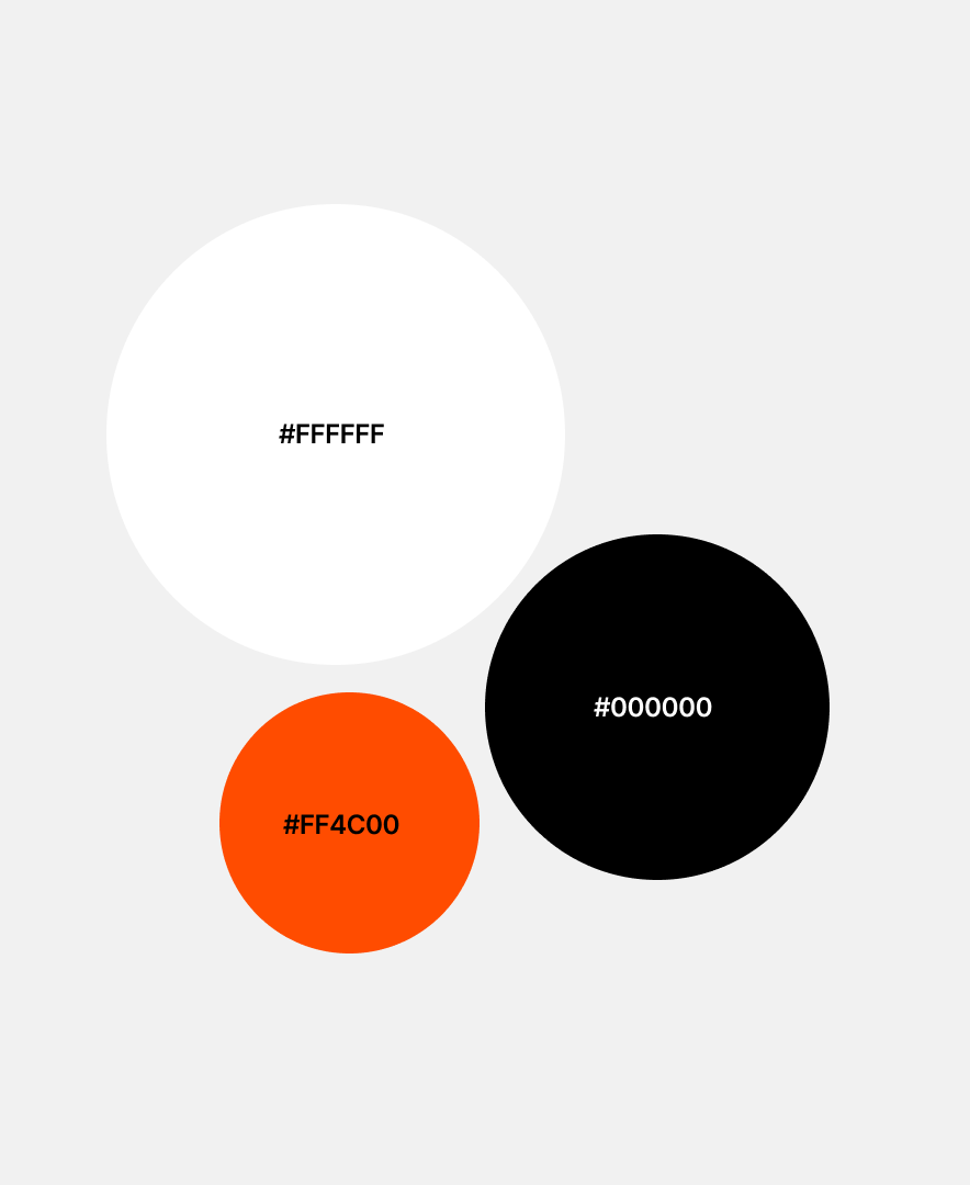
Heading / 24px
Subheading / 16px
Button text / 14px
Heading / 20px
Subheading / 14px
Body / 14px
Alt text / 11px
90% Time on Task
71% Completion Time
94% System Usability Scale (SUS).
Deliver phase
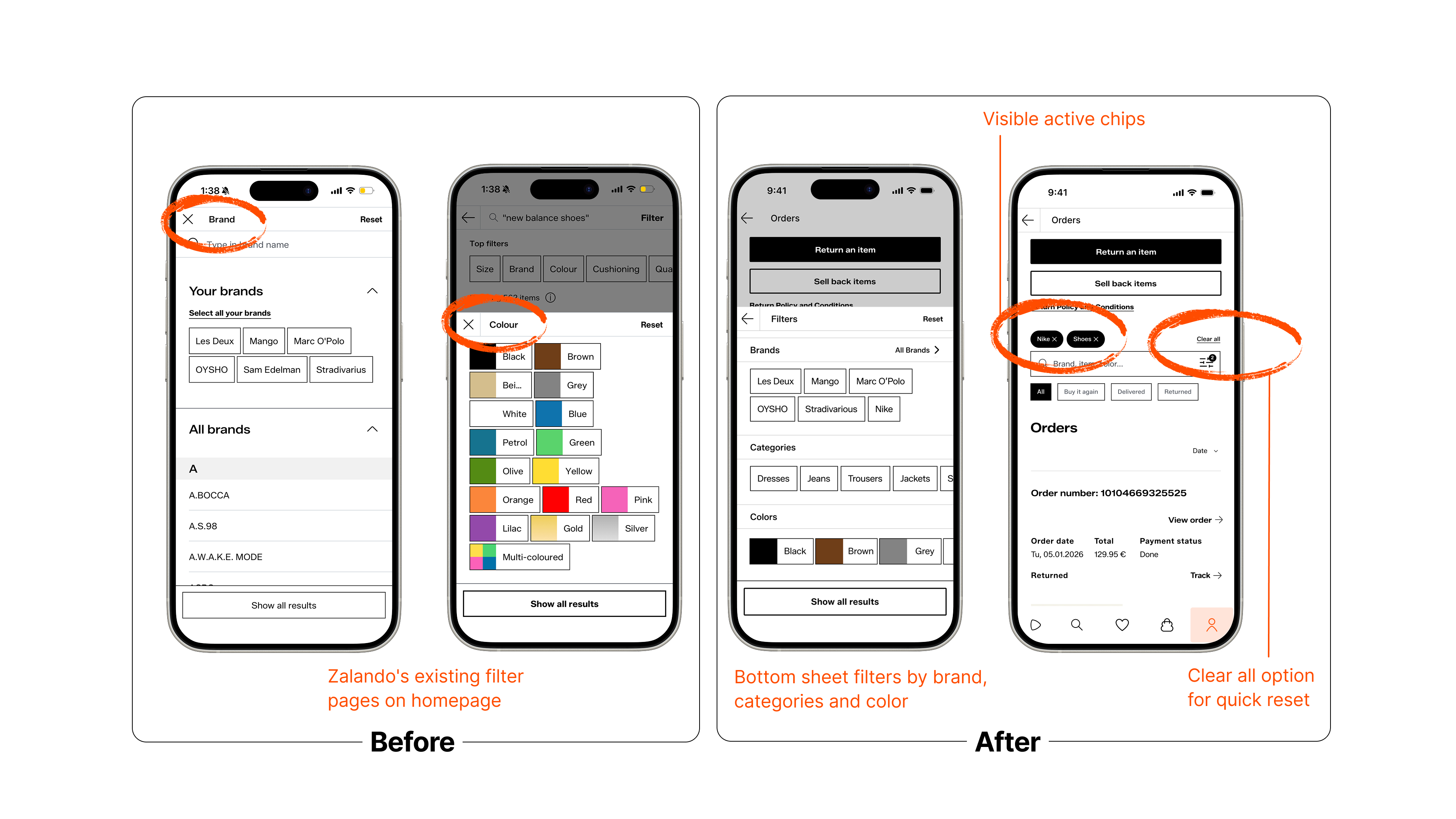
Filter interaction in the redesigned Orders page reuses Zalando’s existing bottom sheet pattern from product discovery, ensuring consistency and familiarity. Active filters appear as chips and on the icon, with a “Clear all” option for quick reset that enhancing usability, visibility of system status, and seamless navigation.
This project started with a simple observation with managing past orders on Zalando is more frustrating than it should be. Through user research, competitive analysis, and usability testing, that observation turned into a clear design direction.
The solution wasn't a full redesign. It was about identifying the right friction points and adding targeted features that feel native to the product: keyword search, multi-parameter filtering, and better order status visibility. Every decision was grounded in research and guided by Zalando's existing design language.
The result is an order history experience that respects the user's time and gives them a reason to come back.
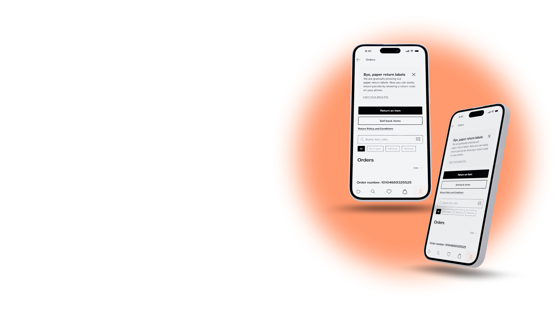
A research-driven feature addition to Zalando's order history experience.
View Prototype
Summary
This is a course project focused on Zalando's order history experience. Instead of a full redesign, the goal was research-driven: understand where real users struggle, then propose features that slot into the existing product.
Through user research and a Double Diamond Lite process, one friction point stood out clearly that managing past orders is harder than it should be. No keyword search, a single date filter, and a long undifferentiated list. For someone tracking a return or trying to reorder something, that's a frustrating dead end.
The outcome was three targeted feature additions: keyword search within order history, multi-parameter filtering by status, category, and date, and clearer order status visibility. Small additions, but aimed at a high-intent moment in the user journey where trust and loyalty are on the line.
Role : UX Researcher, Designer
Scope : Order history page
Tools: Figma, Claude, Maze
AI-assisted: Claude for analysis, ChatGpt for content
Duration: 4 Weeks
Course Project
double diamond lite
To understand current user frustrations and identify market standards for order navigation.
To narrow the scope and define a clear goal: Reducing the "Time-to-Item" for past purchases.
To evaluate solutions for the best balance between user needs and business/tech constraints.
Lo-Fi Wireframes
Refining the design based on test results.
Discover phase
I researched customer reviews on Trustpilot, App store and Google Play
“Checking old orders on my phone is a nightmare. The page takes forever to load as you scroll. A search box would let me jump straight to the item name.”
”I have hundreds of orders. I only want to see my shoe purchases, but I have to scan through the entire list. We need category-based filtering.”
”I only want to see my purchases from last month, but the system shows me everything back to 2022. Quick date-selection chips are a must.”
“I needed to find a red dress I bought last year, but I don't remember the name. I expected to find it by typing 'red' in a search box, but that feature doesn't exist.”
”Sometimes I forget the exact product name and just want to search for 'jeans'. Searching within orders is a basic feature; why is it missing?”
”I have way too many orders. I wish I could just tap a 'Shoes' or 'Last 6 Months' button to filter the list instantly. Scrolling through everything is such a waste of time.”
”I constantly buy from the same brands. Not being able to search or filter by brand within my own order history is a huge miss.”
”I wanted to check the size of a coat I bought 3 years ago, but I had to scroll forever. I wish there was a search bar at the top so I could just type the brand and find it instantly.”
Discover phase
Feature
Amazon
ABOUT YOU
ASOS
Mytheresa
Zalando
Current
Keyword Search
Yes (Full)
No
No
No
No
Status Filter
Detailed
Basic
Return focus
Minimalist
No
Date Range
Multi-year
Past 6 months
Past 6 months
Full History
Limited
Visual Style
List-heavy
Personalised
High Fashion
High Fashion
Product-first
Buy It Again
Dedicated
Shortcut
Integrated
No
Available but not directly
Discover phase
Persistent Search Bar
Keyword search with inline chips: status, category, brand, date
Status Filter
Clear visual separation of all, delivered, returned orders
Date range quick-select presets
"Last 30 days", "Last 6 months", "This year" options reduces infinite scroll fatigue
Brand / category filtering for repeat buyers
Supports loyalty behaviour as "show me all my Nike orders"
Product visual + direct "Buy Again" shortcut
Supports faster re-ordering, reduces search clicks
Define phase
The Goal: Find specific past orders, track returns
Pain Point: Can’t locate items or see clear status
Need: Strong search, clear order status, advanced filters
The Goal: Quickly rebuy past items or similar versions
Pain Point: Hard to rediscover products or filter by brand
Need: “Buy Again”, brand filters, easy reordering
DeFINE phase
Zalando customers experience the inability to efficiently find, filter, or revisit past orders when they try to
manage their order history,
searching for returns,
or items they want to repurchase
in an interface that offers no keyword search and only a single date filter.
This is a problem because it creates friction and erodes trust in the platform, ultimately reducing loyalty-driven repurchase behaviour..
90% Time on Task
71% Completion Time
94% System Usability Scale (SUS).
Heading / 24px
Subheading / 16px
Butoon text / 14px
Heading / 20px
Subheading / 14px
Body / 14px
Alt text / 11px
Deliver phase
Filter interaction in the redesigned Orders page reuses Zalando’s existing bottom sheet pattern from product discovery, ensuring consistency and familiarity. Active filters appear as chips and on the icon, with a “Clear all” option for quick reset that enhancing usability, visibility of system status, and seamless navigation.
This project started with a simple observation with managing past orders on Zalando is more frustrating than it should be. Through user research, competitive analysis, and usability testing, that observation turned into a clear design direction.
The solution wasn't a full redesign. It was about identifying the right friction points and adding targeted features that feel native to the product: keyword search, multi-parameter filtering, and better order status visibility. Every decision was grounded in research and guided by Zalando's existing design language.
The result is an order history experience that respects the user's time and gives them a reason to come back.
A research-driven feature addition to Zalando's order history experience.
View Prototype
Summary
This is a course project focused on Zalando's order history experience. Instead of a full redesign, the goal was research-driven: understand where real users struggle, then propose features that slot into the existing product.
Through user research and a Double Diamond Lite process, one friction point stood out clearly that managing past orders is harder than it should be. No keyword search, a single date filter, and a long undifferentiated list. For someone tracking a return or trying to reorder something, that's a frustrating dead end.
The outcome was three targeted feature additions: keyword search within order history, multi-parameter filtering by status, category, and date, and clearer order status visibility. Small additions, but aimed at a high-intent moment in the user journey where trust and loyalty are on the line.
Role : UX Researcher, Designer
Scope : Order history page
Tools: Figma, Claude, Maze
AI-assisted: Claude for analysis, ChatGpt for content
Duration: 4 Weeks
Course Project
double diamond lite
To understand current user frustrations and identify market standards for order navigation.
To narrow the scope and define a clear goal: Reducing the "Time-to-Item" for past purchases.
To evaluate solutions for the best balance between user needs and business/tech constraints.
Refining the design based on test results.
Discover phase
I researched customer reviews on Trustpilot, App store and Google Play
“Checking old orders on my phone is a nightmare. The page takes forever to load as you scroll. A search box would let me jump straight to the item name.”
”I have hundreds of orders. I only want to see my shoe purchases, but I have to scan through the entire list. We need category-based filtering.”
”I only want to see my purchases from last month, but the system shows me everything back to 2022. Quick date-selection chips are a must.”
“I needed to find a red dress I bought last year, but I don't remember the name. I expected to find it by typing 'red' in a search box, but that feature doesn't exist.”
”Sometimes I forget the exact product name and just want to search for 'jeans'. Searching within orders is a basic feature; why is it missing?”
”I have way too many orders. I wish I could just tap a 'Shoes' or 'Last 6 Months' button to filter the list instantly. Scrolling through everything is such a waste of time.”
”I constantly buy from the same brands. Not being able to search or filter by brand within my own order history is a huge miss.”
”I wanted to check the size of a coat I bought 3 years ago, but I had to scroll forever. I wish there was a search bar at the top so I could just type the brand and find it instantly.”
Discover phase
Feature
Amazon
ABOUT YOU
ASOS
Mytheresa
Zalando
Current
Keyword Search
Yes (Full)
No
No
No
No
Status Filter
Detailed
Basic
Return focus
Minimalist
No
Date Range
Multi-year
Past 6 months
Past 6 months
Full History
Limited
Visual Style
List-heavy
Personalised
High Fashion
High Fashion
Product-first
Buy It Again
Dedicated
Shortcut
Integrated
No
Available but not directly
Discover phase
Persistent Search Bar
Keyword search with inline chips: status, category, brand, date
Status Filter
Clear visual separation of all, delivered, returned orders
Date range quick-select presets
"Last 30 days", "Last 6 months", "This year" options reduces infinite scroll fatigue
Brand / category filtering for repeat buyers
Supports loyalty behaviour as "show me all my Nike orders"
Product visual + direct "Buy Again" shortcut
Supports faster re-ordering, reduces search clicks
Define phase
The Goal: Find specific past orders, track returns
Pain Point: Can’t locate items or see clear status
Need: Strong search, clear order status, advanced filters
The Goal: Quickly rebuy past items or similar versions
Pain Point: Hard to rediscover products or filter by brand
Need: “Buy Again”, brand filters, easy reordering
DeFINE phase
Zalando customers experience the inability to efficiently find, filter, or revisit past orders when they try to
manage their order history,
searching for returns,
or items they want to repurchase
in an interface that offers no keyword search and only a single date filter.
This is a problem because it creates friction and erodes trust in the platform, ultimately reducing loyalty-driven repurchase behaviour..
Heading / 24px
Subheading / 16px
Butoon text / 14px
Heading / 20px
Subheading / 14px
Body / 14px
Alt text / 11px
90% Time on Task
71% Completion Time
94% System Usability Scale (SUS).
Deliver phase
Filter interaction in the redesigned Orders page reuses Zalando’s existing bottom sheet pattern from product discovery, ensuring consistency and familiarity. Active filters appear as chips and on the icon, with a “Clear all” option for quick reset that enhancing usability, visibility of system status, and seamless navigation.
This project started with a simple observation with managing past orders on Zalando is more frustrating than it should be. Through user research, competitive analysis, and usability testing, that observation turned into a clear design direction.
The solution wasn't a full redesign. It was about identifying the right friction points and adding targeted features that feel native to the product: keyword search, multi-parameter filtering, and better order status visibility. Every decision was grounded in research and guided by Zalando's existing design language.
The result is an order history experience that respects the user's time and gives them a reason to come back.