09
User Interviews
30+
Survey Responses
03
Key User
Groups
A multilingual event discovery app for Munich, designed research-first, validated by real users.
Product Overview
Locals, expats, and students in Munich constantly miss events they'd actually enjoy because event info is scattered, mostly in German, and impossible to personalize. There's no single app that works for someone who just moved to Munich and wants to find a jazz concert in English tonight. WhatUp was designed to fix that.
Role : UX/UI Design, Branding, Research, Prototyping, Testing
AI-assisted: Claude for analysis, ChatGpt and Nanobanana for content
Tools: Figma, FigJam, Notion
Duration: 10 Weeks
Personal Project
Empathize Phase
I conducted 9 interviews and collected over 30 survey responses. Through analysis, I identified three main user groups that shaped the foundation of the app's design.
09
User Interviews
30+
Survey Responses
03
Key User
Groups
Three platforms analyzed. None of them served all three user groups at once.
Empathize Phase
People often miss events they'd enjoy simply because they didn't know about them in time or couldn't find the info in a language they understand.
Expats and tourists feel excluded from local experiences due to language barriers or scattered event information across multiple platforms.
Locals want more personalized recommendations instead of scrolling through generic lists that don't match their interests.
Users expect a seamless mobile-first experience. Existing apps focus too heavily on function over user experience.
Define Phase

“I want to feel like I’m discovering the real Munich not just the touristy stuff.”
Pain → Feels overwhelmed by mainstream event spam, hard to find new experiences
Need → Curated recommendations tailored to her interests, clean and intuitive browsing experience

“I’m always looking for fun things to do, but I wish I could just find it all in English..”
Pain → Most event info is in German, FOMO
Need → Multilingual event filters (especially English)

“I don’t want to miss fun events just because I didn’t know about them in time!”
Pain → Doesn’t have time to browse long lists
Need → Quickly find what’s happening today or tomorrow
Font Family
Inter
Regular
The quick brown fox jumps over the lazy dog
Semibold
The quick brown fox jumps over the lazy dog
Type Scale
Title / 32px
Heading
Title / 24px
Subheading
Body / 16px
Body text for reading
PRIMARY
SECONDARY
ACCENT
Test Phase
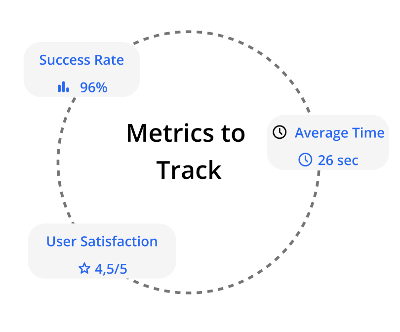
100% of users successfully completed tasks like event searching, saving, sharing, and viewing past tickets.
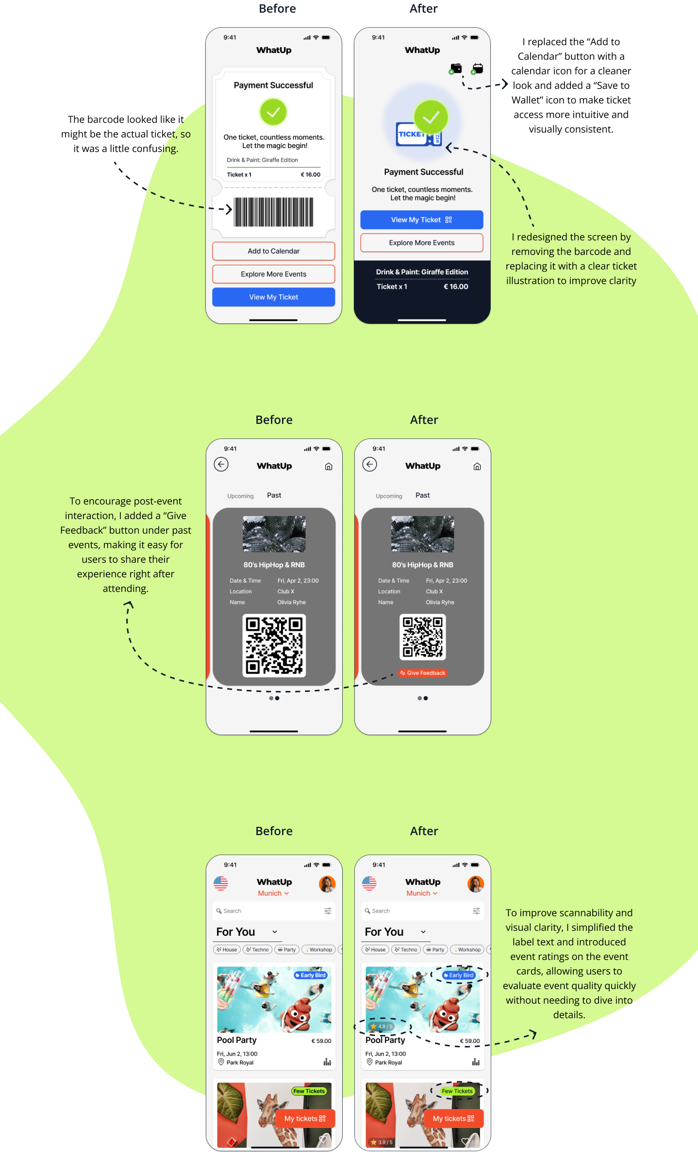
80% completed the payment process without issues, 20% were confused by the barcode image on the confirmation screen.
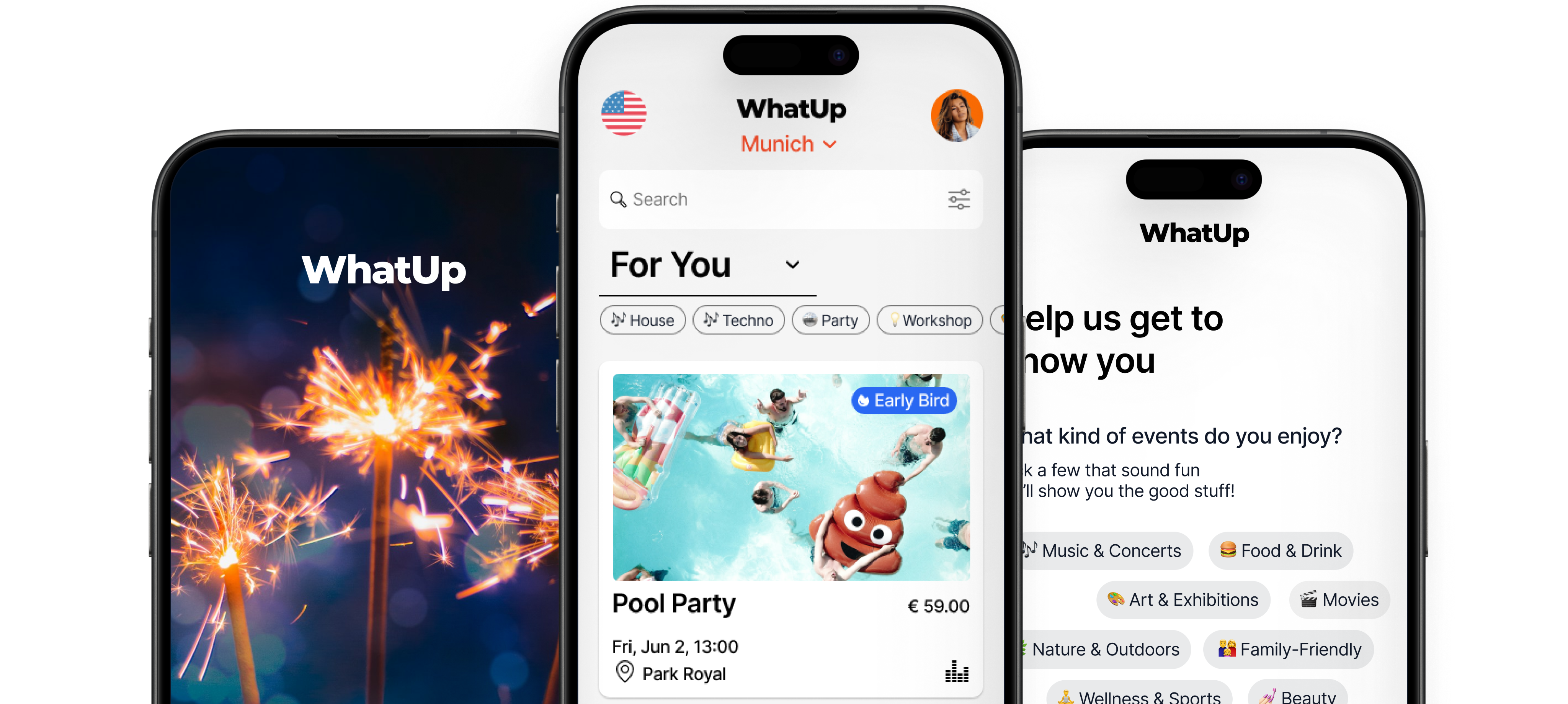
Explore events tailored to your interests, book instantly, and access your ticket in one flow.
Methodology
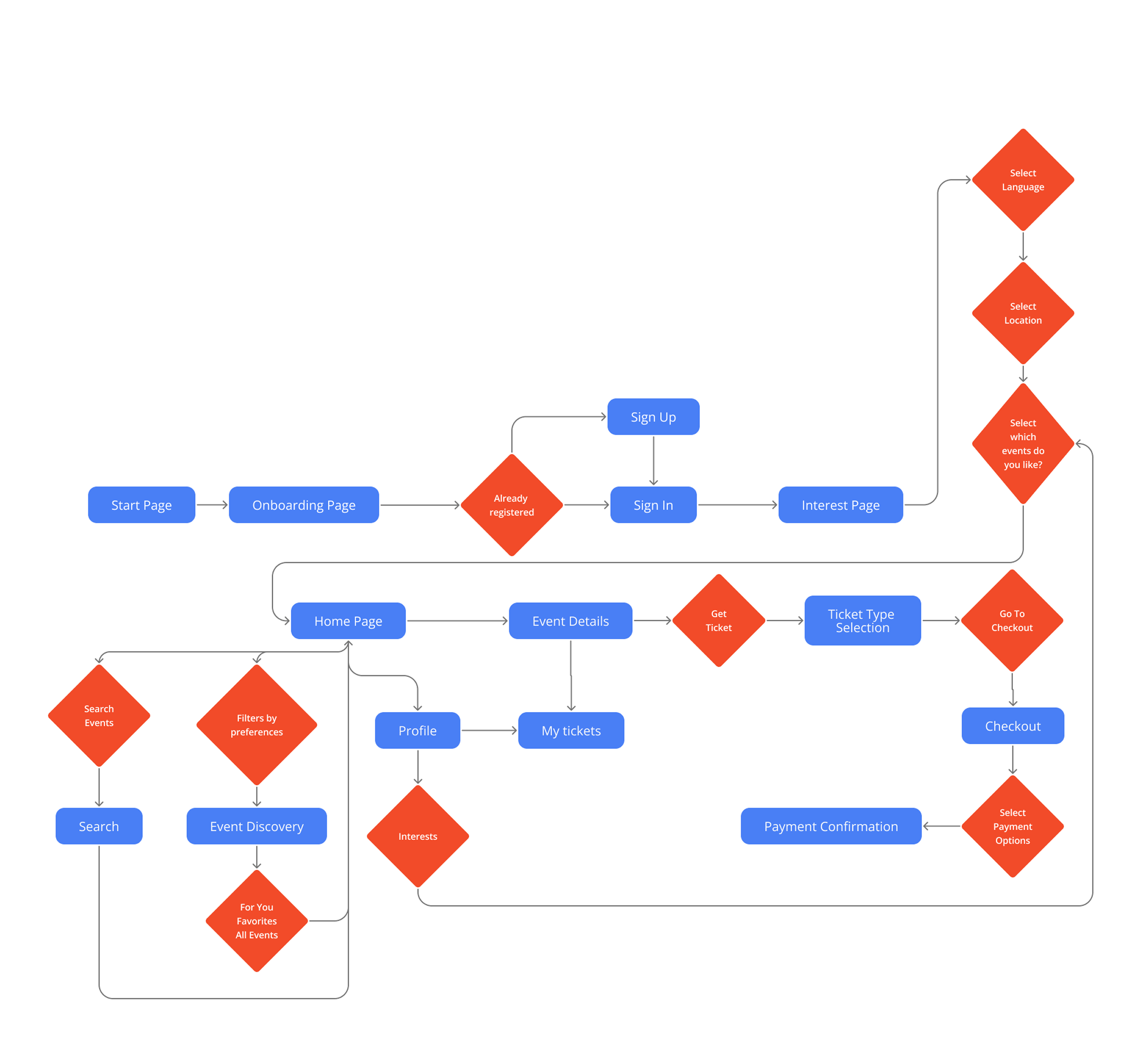
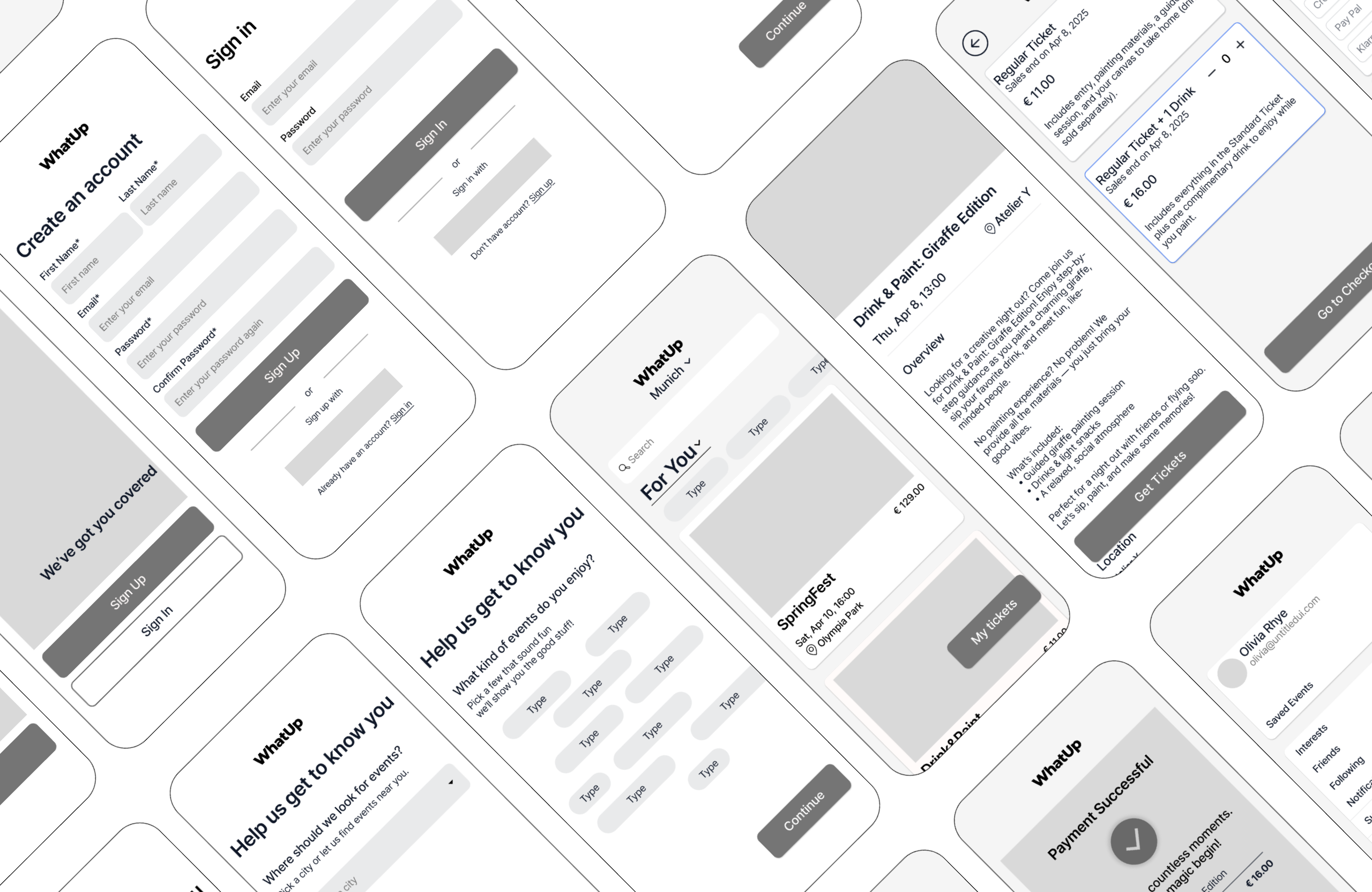
This case study focused on designing an event discovery and ticketing app that offers users a smooth, intuitive, and engaging experience. Starting from user research and journey mapping to interface design and usability testing, the project evolved based on real feedback.
A multilingual event discovery app for Munich, designed research-first, validated by real users.
Product Overview
Locals, expats, and students in Munich constantly miss events they'd actually enjoy because event info is scattered, mostly in German, and impossible to personalize. There's no single app that works for someone who just moved to Munich and wants to find a jazz concert in English tonight. WhatUp was designed to fix that.
Role : UX/UI Design, Branding, Research, Prototyping, Testing
AI-assisted: Claude for analysis, ChatGpt and Nanobanana for content
Tools: Figma, FigJam, Notion
Duration: 10 Weeks
Personal Project
01
User Research
User Interviews
Competitive Analysis
02
User Persona
Goal Statement
03
Brainstorming
User Flow
04
Low-Mid Wireframes
Visual Design
Prototype
05
Usability
Testing
Iterations
Empathize Phase
I conducted 9 interviews and collected over 30 survey responses. Through analysis, I identified three main user groups that shaped the foundation of the app's design.
09
User Interviews
30+
Survey Responses
03
Key User
Groups
Three platforms analyzed. None of them served all three user groups at once.
Empathize Phase
People often miss events they'd enjoy simply because they didn't know about them in time or couldn't find the info in a language they understand.
Expats and tourists feel excluded from local experiences due to language barriers or scattered event information across multiple platforms.
Locals want more personalized recommendations instead of scrolling through generic lists that don't match their interests.
Users expect a seamless mobile-first experience. Existing apps focus too heavily on function over user experience.
Define Phase

“I want to feel like I’m discovering the real Munich not just the touristy stuff.”
Pain → Feels overwhelmed by mainstream event spam, hard to find new experiences
Need → Curated recommendations tailored to her interests, clean and intuitive browsing experience

“I’m always looking for fun things to do, but I wish I could just find it all in English..”
Pain → Most event info is in German, FOMO
Need → Multilingual event filters (especially English)

“I don’t want to miss fun events just because I didn’t know about them in time!”
Pain → Doesn’t have time to browse long lists
Need → Quickly find what’s happening today or tomorrow
research ınsıghts
Font Family
Inter
Regular
The quick brown fox jumps over the lazy dog
Semibold
The quick brown fox jumps over the lazy dog
Type Scale
Title / 32px
Heading
Title / 24px
Subheading
Body / 16px
Body text for reading
PRIMARY
SECONDARY
ACCENT
TEST Phase
100% of users successfully completed tasks like event searching, saving, sharing, and viewing past tickets.
80% completed the payment process without issues, 20% were confused by the barcode image on the confirmation screen.
Explore events tailored to your interests, book instantly, and access your ticket in one flow.
Methodology
This case study focused on designing an event discovery and ticketing app that offers users a smooth, intuitive, and engaging experience. Starting from user research and journey mapping to interface design and usability testing, the project evolved based on real feedback.
A multilingual event discovery app for Munich, designed research-first, validated by real users.
Product Overview
Locals, expats, and students in Munich constantly miss events they'd actually enjoy because event info is scattered, mostly in German, and impossible to personalize. There's no single app that works for someone who just moved to Munich and wants to find a jazz concert in English tonight. WhatUp was designed to fix that.
Role : UX/UI Design, Branding, Research, Prototyping, Testing
AI-assisted: Claude for analysis, ChatGpt and Nanobanana for content
Tools: Figma, FigJam, Notion
Duration: 10 Weeks
Personal Project
01
User Research
User Interviews
Competitive Analysis
02
User Persona
Goal Statement
03
Brainstorming
User Flow
04
Low-Mid Wireframes
Visual Design
Prototype
05
Usability
Testing
Iterations
Empathize Phase
I conducted 9 interviews and collected over 30 survey responses. Through analysis, I identified three main user groups that shaped the foundation of the app's design.
09
User Interviews
30+
Survey Responses
03
Key User
Groups
Three platforms analyzed. None of them served all three user groups at once.
Empathize Phase
People often miss events they'd enjoy simply because they didn't know about them in time or couldn't find the info in a language they understand.
Expats and tourists feel excluded from local experiences due to language barriers or scattered event information across multiple platforms.
Locals want more personalized recommendations instead of scrolling through generic lists that don't match their interests.
Users expect a seamless mobile-first experience. Existing apps focus too heavily on function over user experience.
Define Phase
“I want to feel like I’m discovering the real Munich not just the touristy stuff.”
Pain → Feels overwhelmed by mainstream event spam, hard to find new experiences
Need → Curated recommendations tailored to her interests, clean and intuitive browsing experience
“I’m always looking for fun things to do, but I wish I could just find it all in English..”
Pain → Most event info is in German, FOMO
Need → Multilingual event filters (especially English)
“I don’t want to miss fun events just because I didn’t know about them in time!”
Pain → Doesn’t have time to browse long lists
Need → Quickly find what’s happening today or tomorrow
research ınsıghts
Font Family
Inter
Regular
The quick brown fox jumps over the lazy dog
Semibold
The quick brown fox jumps over the lazy dog
Type Scale
Title / 32px
Heading
Title / 24px
Subheading
Body / 16px
Body text for reading
PRIMARY
SECONDARY
ACCENT
TEST Phase
100% of users successfully completed tasks like event searching, saving, sharing, and viewing past tickets.
80% completed the payment process without issues, 20% were confused by the barcode image on the confirmation screen.
Explore events tailored to your interests, book instantly, and access your ticket in one flow.
Methodology
This case study focused on designing an event discovery and ticketing app that offers users a smooth, intuitive, and engaging experience. Starting from user research and journey mapping to interface design and usability testing, the project evolved based on real feedback.