UX/UI CASE STUDY · MOBILE Redesıgn · 2025
Letterboxd
Redesign
Role
UX/UI Design,, Visual Hierarchy
Duration
4 Weeks (Jul – Aug 2025)
Tools
Figma
Platform
Mobile (iOS)
PRoduct Overview
Redesigning a
movie lover’s home.
This project involved redesigning the Movie Detail Page within the Letterboxd mobile app. Letterboxd is a social media app for movie lovers that a platform where users can log films, rate them, write reviews, and connect with other cinephiles.
The original Movie Detail Page had several usability and visual hierarchy issues that made it difficult for users to engage with the app's core features. My goal was to transform it into a highly usable, scannable, and visually appealing interface.
Focus
Movie Detail Page
Duration
4 Weeks
Tools
Figma
AI-assısted
Claude
Letterboxd
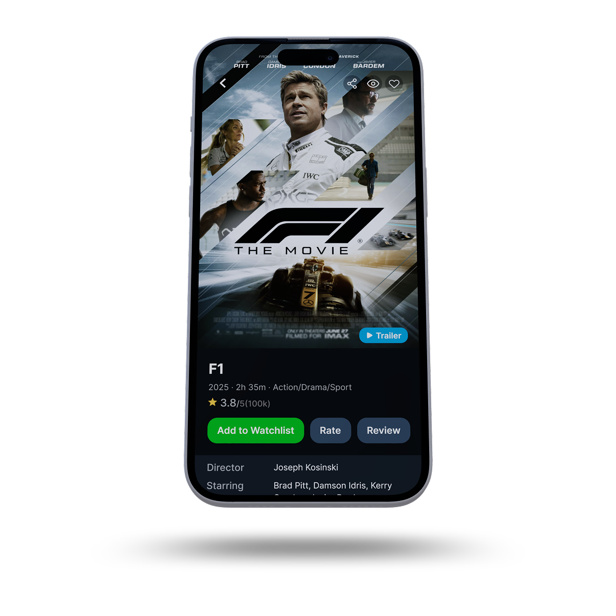
previous design
A look at the original interface before redesign improvements
Problem Statement
What wasn’t
working.
Information Overload
The screen felt cluttered with too much information competing for attention, making it difficult to quickly grasp key details.
Inconsistent Grouping
Related information was not always grouped logically, leading to a fragmented user experience.
Suboptinal Visual Hierarchy
The movie poster was too small and didn't serve as an effective focal point, reducing visual impact.
Hidden Core Actions
Key actions like "Add to Watchlist," "Rate," and "Review" were hidden or required excessive scrolling, hindering engagement.
Poor Scannability
Important actions and information weren't immediately discoverable due to inconsistent spacing and small font sizes.
Lack of Visual Appeal
The overall aesthetic could be improved to create a more modern and engaging interface for movie enthusiasts.
Objectıves
The Goal
My primary objective was to transform the Movie Detail Page into a highly usable, scannable, and visually appealing interface. Specifically, I aimed to improve across five dimensions.
Clarity
Aesthetics
Scannability
Usability
Action Flow
Design decisions
Key Design
Improvements
Visual Hierarchy
Enlarged Movie Poster
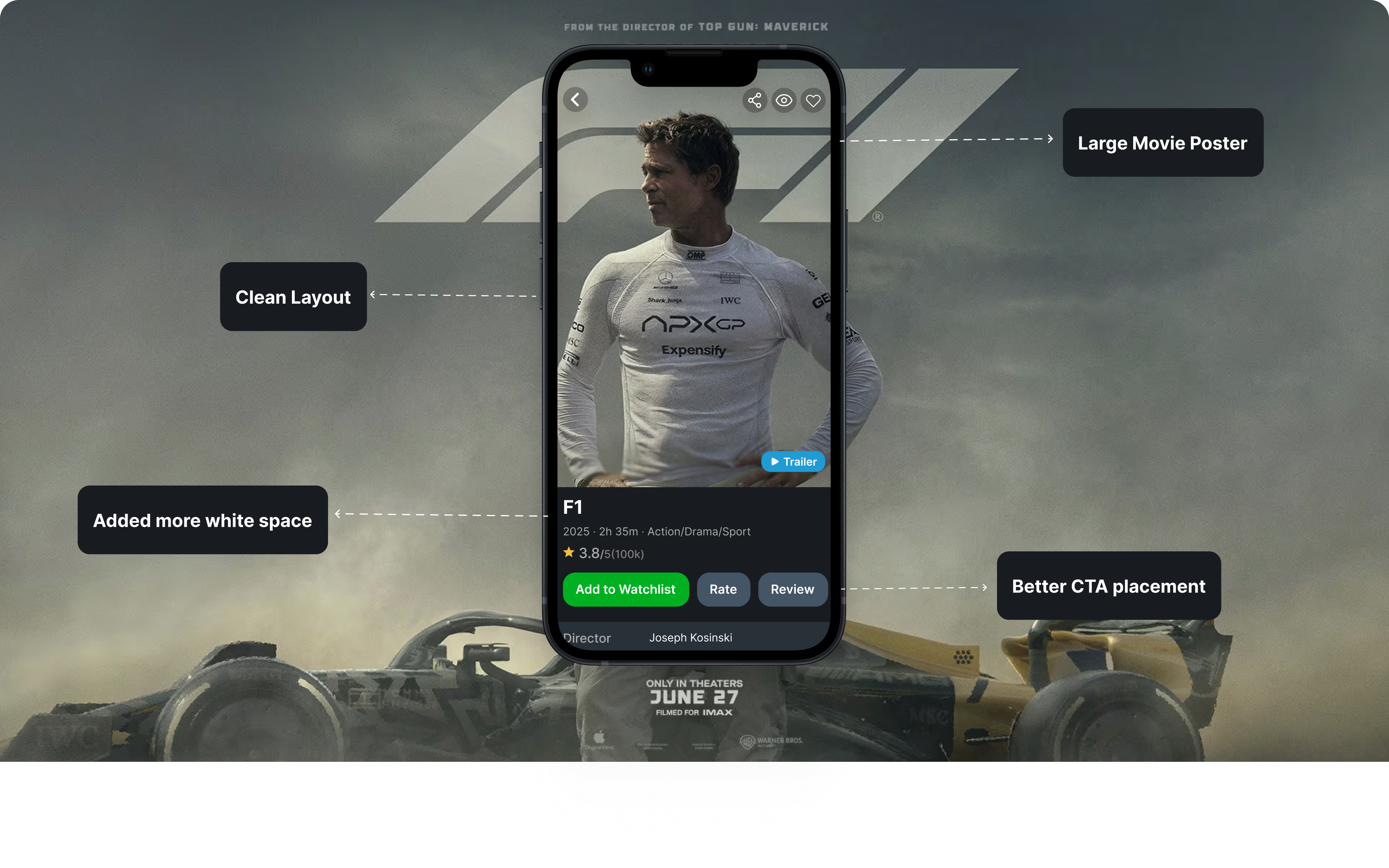
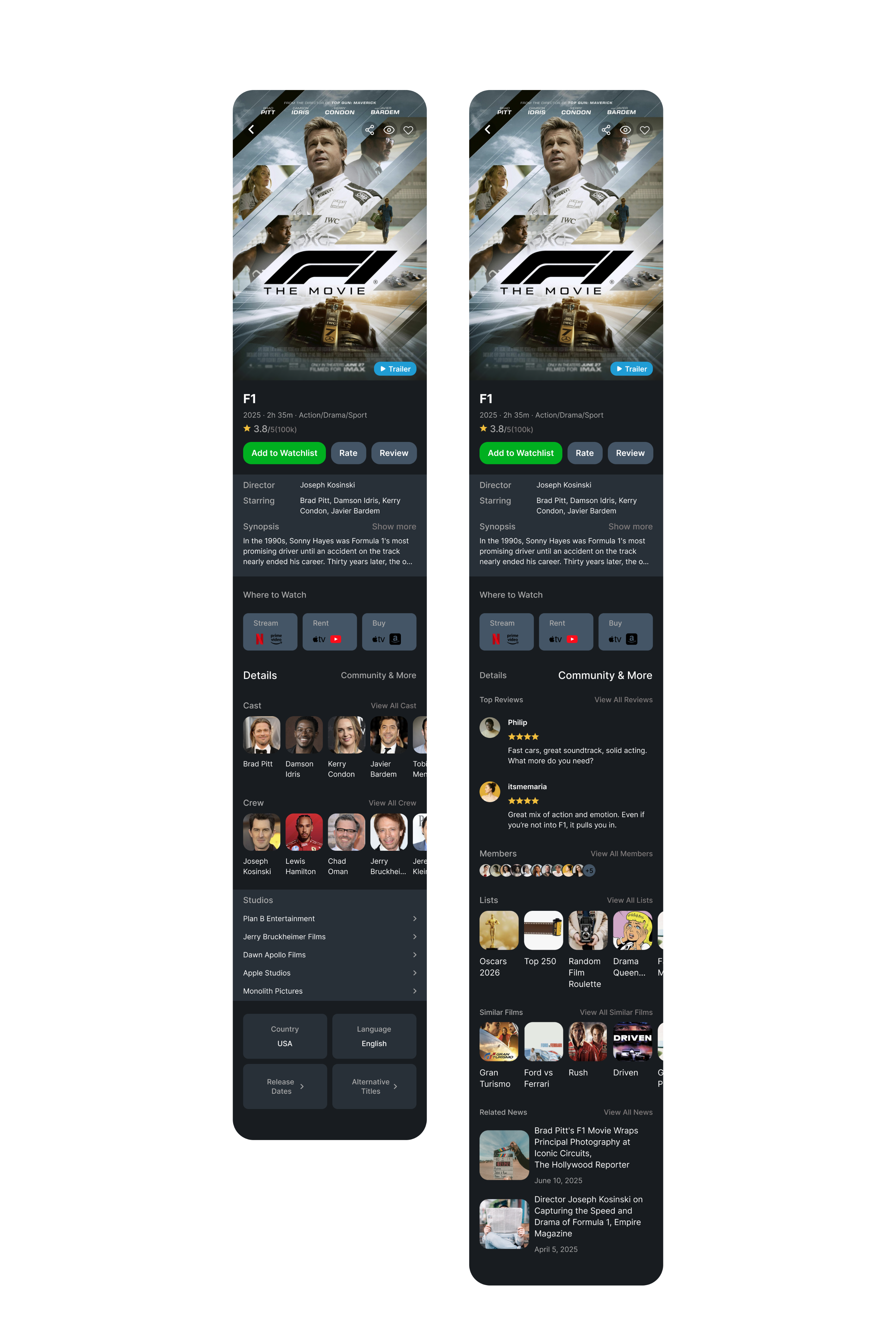
By significantly increasing the size of the movie poster at the top of the screen, I established a clear visual anchor, immediately immersing the user in the film's identity and allowing for more impactful imagery.
accessibility
Visible Synopsis
The synopsis was made immediately visible without requiring an extra tap or scroll that provides allowing users to quickly understand the film's premise without unnecessary friction.
Action Flow
Surfaced Key Actions
"Add to Watchlist," "Rate," and "Review" buttons were placed directly below the movie title and synopsis in order to making these crucial actions immediately accessible and encouraging interaction.
Readability
Improved Spacing & Typography
A more generous and consistent spacing system was applied throughout. Typography was refined with appropriate font sizes and weights to establish a clear hierarchy of information.
Discovery
Streamlined “Where to Watch”
This section was given a more prominent and organized layout, making it easier for users to find streaming, rental, or purchase options at a glance.
Consistency
Consistent Iconography
Standardized icons and button styles were used throughout to create a cohesive and professional look across the entire page.
High fıdelıty wıreframes
Final Designs
What I learned
Reflection

Saw how small design choices like spacing, poster size, layout , can greatly improve usability and completely change how a user feels about a product.
Strengthened skills in visual hierarchy and information architecture that learning to prioritize what users need to see first versus what can wait.

Reinforced the importance of a user-centered approach for creating intuitive, enjoyable experiences.
Learned to balance clarity and simplicity with the need to present sufficient information and finding the right level of detail without overwhelming the user.
Methodology
Conclusion
This redesign project was an excellent exercise in applying UX principles to a real-world product. By focusing on hierarchy, scannability, and surfacing core actions, the redesigned Letterboxd Movie Detail Page creates a much more engaging and user-friendly experience for movie lovers.
UX/UI CASE STUDY · MOBILE Redesıgn · 2025
Letterboxd
Redesign
Role
UX/UI Design, Visual Hierarchy
Duration
4 Weeks (Jul - Aug 2025)
Tools
Figma
Platform
Mobile (iOS)
PRoduct Overview
Redesigning a
movie lover’s home.
This project involved redesigning the Movie Detail Page within the Letterboxd mobile app. Letterboxd is a social media app for movie lovers that a platform where users can log films, rate them, write reviews, and connect with other cinephiles.
The original Movie Detail Page had several usability and visual hierarchy issues that made it difficult for users to engage with the app's core features. My goal was to transform it into a highly usable, scannable, and visually appealing interface.
Focus
Movie Detail Page
Duration
4 Weeks
Tools
Figma
AI-assısted
Claude
Letterboxd
previous design
A look at the original interface before redesign improvements
Problem Statement
What wasn’t
working.
Information Overload
The screen felt cluttered with too much information competing for attention, making it difficult to quickly grasp key details.
Inconsistent Grouping
Related information was not always grouped logically, leading to a fragmented user experience.
Suboptinal Visual Hierarchy
The movie poster was too small and didn't serve as an effective focal point, reducing visual impact.
Hidden Core Actions
Key actions like "Add to Watchlist," "Rate," and "Review" were hidden or required excessive scrolling, hindering engagement.
Poor Scannability
Important actions and information weren't immediately discoverable due to inconsistent spacing and small font sizes.
Lack of Visual Appeal
The overall aesthetic could be improved to create a more modern and engaging interface for movie enthusiasts.
Objectıves
The Goal
My primary objective was to transform the Movie Detail Page into a highly usable, scannable, and visually appealing interface. Specifically, I aimed to improve across five dimensions.
Clarity
Aesthetics
Scannability
Usability
Action Flow
Design decisions
Key Design
Improvements
Visual Hierarchy
Enlarged Movie Poster
By significantly increasing the size of the movie poster at the top of the screen, I established a clear visual anchor, immediately immersing the user in the film's identity and allowing for more impactful imagery.
accessibility
Visible Synopsis
The synopsis was made immediately visible without requiring an extra tap or scroll that provides allowing users to quickly understand the film's premise without unnecessary friction.
Action Flow
Surfaced Key Actions
"Add to Watchlist," "Rate," and "Review" buttons were placed directly below the movie title and synopsis in order to making these crucial actions immediately accessible and encouraging interaction.
Readability
Improved Spacing & Typography
A more generous and consistent spacing system was applied throughout. Typography was refined with appropriate font sizes and weights to establish a clear hierarchy of information.
Discovery
Streamlined “Where to Watch”
This section was given a more prominent and organized layout, making it easier for users to find streaming, rental, or purchase options at a glance.
Consistency
Consistent Iconography
Standardized icons and button styles were used throughout to create a cohesive and professional look across the entire page.
High fıdelıty wıreframes
Final Designs
What I learned
Reflection
Saw how small design choices like spacing, poster size, layout , can greatly improve usability and completely change how a user feels about a product.
Strengthened skills in visual hierarchy and information architecture that learning to prioritize what users need to see first versus what can wait.
Reinforced the importance of a user-centered approach for creating intuitive, enjoyable experiences.
Learned to balance clarity and simplicity with the need to present sufficient information and finding the right level of detail without overwhelming the user.
Conclusion
This redesign project was an excellent exercise in applying UX principles to a real-world product. By focusing on hierarchy, scannability, and surfacing core actions, the redesigned Letterboxd Movie Detail Page creates a much more engaging and user-friendly experience for movie lovers.
UX/UI CASE STUDY · MOBILE Redesıgn · 2025
Letterboxd
Redesign
Role
UX/UI Design, Visual Hierarchy
Duration
4 Weeks (Jul - Aug 2025)
Tools
Figma
Platform
Mobile (iOS)
PRoduct Overview
Redesigning a
movie lover’s home.
This project involved redesigning the Movie Detail Page within the Letterboxd mobile app. Letterboxd is a social media app for movie lovers that a platform where users can log films, rate them, write reviews, and connect with other cinephiles.
The original Movie Detail Page had several usability and visual hierarchy issues that made it difficult for users to engage with the app's core features. My goal was to transform it into a highly usable, scannable, and visually appealing interface.
Focus
Movie Detail Page
Duration
4 Weeks
Tools
Figma
AI-assısted
Claude
Letterboxd
Previous Design
A look at the original interface before redesign improvements
Problem Statement
What wasn’t
working.
Information Overload
The screen felt cluttered with too much information competing for attention, making it difficult to quickly grasp key details.
Inconsistent Grouping
Related information was not always grouped logically, leading to a fragmented user experience.
Suboptinal Visual Hierarchy
The movie poster was too small and didn't serve as an effective focal point, reducing visual impact.
Hidden Core Actions
Key actions like "Add to Watchlist," "Rate," and "Review" were hidden or required excessive scrolling, hindering engagement.
Poor Scannability
Important actions and information weren't immediately discoverable due to inconsistent spacing and small font sizes.
Lack of Visual Appeal
The overall aesthetic could be improved to create a more modern and engaging interface for movie enthusiasts.
Objectıves
The Goal
My primary objective was to transform the Movie Detail Page into a highly usable, scannable, and visually appealing interface. Specifically, I aimed to improve across five dimensions.
Clarity
Aesthetics
Scannability
Usability
Action Flow
Design decisions
Key Design
Improvements
Visual Hierarchy
Enlarged Movie Poster
By significantly increasing the size of the movie poster at the top of the screen, I established a clear visual anchor, immediately immersing the user in the film's identity and allowing for more impactful imagery.
Accessibility
Visible Synopsis
The synopsis was made immediately visible without requiring an extra tap or scroll that provides allowing users to quickly understand the film's premise without unnecessary friction.
Action Flow
Surfaced Key Actions
"Add to Watchlist," "Rate," and "Review" buttons were placed directly below the movie title and synopsis in order to making these crucial actions immediately accessible and encouraging interaction.
Readability
Improved Spacing & Typography
A more generous and consistent spacing system was applied throughout. Typography was refined with appropriate font sizes and weights to establish a clear hierarchy of information.
Discovery
Streamlined “Where to Watch”
This section was given a more prominent and organized layout, making it easier for users to find streaming, rental, or purchase options at a glance.
Consistency
Consistent Iconography
Standardized icons and button styles were used throughout to create a cohesive and professional look across the entire page.
High fıdelıty wıreframes
Final Designs
What I learned
Reflection
Saw how small design choices like spacing, poster size, layout , can greatly improve usability and completely change how a user feels about a product.
Strengthened skills in visual hierarchy and information architecture that learning to prioritize what users need to see first versus what can wait.
Reinforced the importance of a user-centered approach for creating intuitive, enjoyable experiences.
Learned to balance clarity and simplicity with the need to present sufficient information and finding the right level of detail without overwhelming the user.
Methodology
Conclusion
This redesign project was an excellent exercise in applying UX principles to a real-world product. By focusing on hierarchy, scannability, and surfacing core actions, the redesigned Letterboxd Movie Detail Page creates a much more engaging and user-friendly experience for movie lovers.